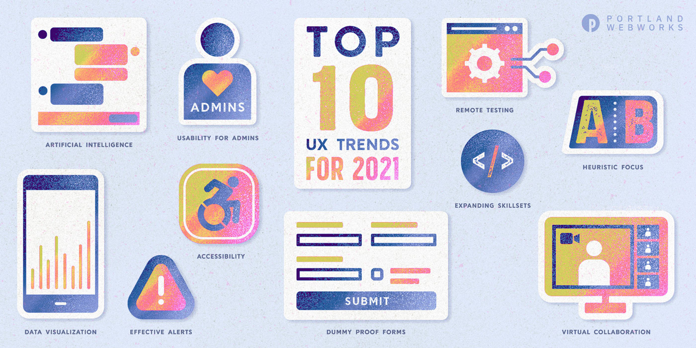
With 2020 behind us, we’ve all been working hard to make a fresh start in 2021. However, I find, as a designer, that the events of 2020 are still impacting how we interact online. Here’s a look at the top 10 user experience (UX) design takeaways from 2020, and how they’re making a difference in 2021.
Also, check out the infographic version of this post.
1. UX Can Be the Stress Rx
If 2020 had a tagline, it would be this: “Our stress levels are high.” The typical individual’s stress skyrocketed during the pandemic, and the role of stress on a digital application user became all the more relevant. As designers, we are in a position of power because good UX design can mitigate a user’s stress and avoid complications in their online experience by:
- Presenting a minimal set of choices on each screen
- Providing a clear and error-tolerant UI
- Honing messaging and language to avoid either over- or under-communicating
Conversely, bad UX design can seriously contribute to a user’s stress and cause heightened rates of errors and abandonment. Struggling to understand the feeling of stress and tension that can arise from a poor UI? Play around with the online game User Inyerface and just see how long you last.
There are a few things we did this year to provide positive experiences for stressed-out users. We conducted user research aimed at uncovering their needs, and put Nielsen’s 10 Heuristics for User Interface Design to use. These principles, when applied, ensure the design adheres to basic rules and establishes a user-friendly foundation. And we didn’t ignore the role of content strategy. We built trust by applying strong, thoughtful content strategy that was authentic, consistent, and supportive of the customers’ interactions with our applications.
2. Forms Should Be Easy
Oh boy, we did a lot online last year. People who’d held onto more manual processes, like registering their dog using paper forms, were forced to utilize web-based tools in response to changing and inconsistent business hours, new personal challenges, and the need to stay socially distanced from other people. We did more online or remotely in 2020 than ever before, and that brought along increased emphasis on friendly and usable online forms.
Think about your favorite little coffee shop, bakery, or corner store…did they have online ordering prior to a pandemic that has changed the way stores engage with customers? I bet they do now. Small businesses everywhere had to quickly spin up online shopping and ordering tools that they hadn’t previously used. And in America, we voted! There is also more to be done to improve the paper forms utilized by citizens. This NY Times Opinion shows how the UX of paper ballots could be improved to reduce voter error and increase the validity of votes.
To address this need, we honed our expertise in form design and challenged ourselves to make dummy-proof forms that any user, of any ability, could complete. This article from the UX Collective on form best practices is a great read on the topic.
3. Alerts Need to Work
Almost every public or consumer-facing website in the world has adopted some type of prominent alert to communicate Covid-related protocols or operational adjustments.
Designing a strong site alert depends on understanding your business and use cases. It’s important to understand what goes into a basic alert and what business and user needs the alert aims to satisfy. We asked ourselves things like:
- Is the alert for general awareness, or have the user’s interactions with the organization significantly changed in response to the information in the alert?
- Is the alert likely to be comprised of a brief statement, or is there a lengthier description the user should read?
- In the context of the user’s site visit, how important is it that they see and acknowledge the message in the alert versus potentially ignoring or not seeing it?
The answers to these questions drive important design and experience decisions. We also developed our awareness of alert components in UI kits including the USWDS style guide, which provides an excellent starting point on alert components.
4. Work and Collaboration Has Become Virtual
Your teleconference tech of choice may have gone from novelty to curse during the pandemic, but there’s no denying we have new vigor and motivation for making WFH work for us. The idea that co-location is the best arrangement for collaboration has been challenged as we achieve new levels of work-life balance and make use of the rich technology at our literal fingertips. I, for one, enjoy the 10-foot commute between my couch and workspace, and find the tools for connecting and collaborating very workable.
If you’re in UX, you need to know how to conduct user research in a remote setting. Ask yourself:
- How is it different from in-person research?
- What are the added challenges?
- What are the best tactics (and etiquette!) for virtual interactions?
This Nielsen Norman Group article covers the bases of how to conduct user research in a remote setting. Hint: turning on your camera goes a long way towards creating a friendlier, more engaging setting for user research.
Even when we’re not conducting user research, we still need online tools for brainstorming and collaboration. Electronic whiteboarding with tools like Invision Freehand has helped us remove the barriers of distance. Try it, you won’t even miss the smell of those ‘odorless’ whiteboard markers.
5. Accessibility and Inclusivity Are Baked In
…And if they aren’t, they should be.
Accessibility is not a step along the way, not a footnote, not an afterthought. If we aren’t actively working to ensure that designs and process are inclusive, our products won’t be as good as they could be, and won’t reach as broad an audience. The CDC reports that 1 in 4 adults in the US live with a disability. This gives designers a strong business case not to exclude or fail to accommodate 25% of the population we are targeting!
An organization’s ability to address opportunities for improvement with respect to diversity and inclusivity starts with self-awareness. Design teams can set the tone for incorporating accessible practices and inclusivity throughout the process. To make the need more real, check out the Microsoft Inclusive Design Toolkit, which describes how disabilities affect us all at one point or another, whether due to permanent, temporary, or situational causes. And give Kat Holmes’ powerful Mismatch: How Inclusion Shapes Design a read.
As designers, we can advocate for accessibility to be done better at our organizations. We don’t have to be experts, just allies!
6. Design Knows No Age
Humans are life-long learners, and technology can be a help or a hindrance in the learning process. Especially in our more remote world, users of all ages are utilizing our products so we have to work extra hard to ensure generational differences don’t equate to barriers. Successful cross-generational design should:
- Avoid making assumptions about the user’s prior experience
- Present actions in a bold and prominent manner
- Use plain language
Older generations of users may not have grown up with technology, and they may struggle with things younger users have no trouble with. Clear, recognizable patterns like distinct primary and secondary button styles can help eliminate confusion for novice users of all ages.
It’s so easy to rely on your own perspective, and your own usage and habits, as the basis for your design decisions. So, next time you create a design, see if you can put your prototype in front of an elderly user, your neighbor or grandparent perhaps, and simply observe what they do with it, where they struggle. What types of adjustments would better meet their needs?
7. Data Fluency is More Important Than Ever
Recently we’ve had nothing if not data. Social justice topics, election projections (and results), Covid-19 tracking, and many other important communications now rely on effective data visualization, and the viewer’s ability to perceive it.
What is data fluency? Thoughtspot describes it as the ability to express ideas in the shared language of data, much like being fluent in a spoken language. Why is it important? A picture is worth a thousand words, after all. Some information cannot be conveyed as effectively in a narrative as through visualization. Layer on the opportunities to make massive amounts of data consumable, often in real time, in the palm of your user’s hand, and you’ll start to realize the importance of data visualization in the design of digital experiences.
I found the history of data visualizations fascinating, and especially enjoyed reading about Amanda Cox, the New York Times data editor who has tackled the incredibly complex challenges of how to present data in a way that a reader, in print or in digital formats, can easily understand. When I encountered a project that required effective data visualization, this article equipped me to design for that need.
8. AI is Here to Stay
If you haven’t designed for an experience involving Artificial Intelligence (AI), you probably will soon. AI has been a hot topic in digital experiences for many years, as both AI and UX are intended to be human-centered, helping the user have a better experience, higher satisfaction, and increased success.
In 2021, designers can work to embrace and leverage AI by understanding how AI augments and improves the user experience. Uses include everything from conversational and personalized experiences to content management tools and enhanced accessibility. It’s also important to understand the pitfalls of AI, where it can go wrong, and how to execute this exciting technology in a way that is ethical and respectful of our users.
We started an AI Lab at GovWebworks to look at the ways AI can increase the value of our solutions for our clients and their users. Check out the AI Lab Monthly Newsletter, an email summary of timely articles that have been hand-picked and analyzed by GWW’s AI experts.
9. Admins are Users, Too!
Don’t forget that site administrators and content managers are also users, and designers have a massive opportunity to consider their needs.
Organizations may not value enhancements that only benefit the admin or trained content managers, and may assume there’s little ROI for money spent on the admin side of things. But an effective and efficient administrative interface can have the following benefits:
- Easier for content managers to work with, so website content is more likely to be kept up to date and fresh
- Equates to reduced costs associated with documentation and training
- Creates less demand on the time of those responsible for managing the content
When we do a quick and dirty calculation of ROI for time spent on the administrative interface of the product, we include the time involved in documenting, training, and working with a poor administrative UI compared to the time saved with a strong, friendly administrative UI. With all this in mind, the value of better admin usability sells itself.
10. Multi-Talented Designers Rock
In the past year, we’ve seen designers step up in new ways, including:
- Embracing cross-functional skill sets
- Creating new opportunities for themselves and their organizations
- Achieving efficiencies by sharing work in areas outside their silos
- Expanding traditional designer roles to include business analysis, product ownership, content strategy, accessibility, research, SEO, and coding
Designers who are working comfortably within the classic constraints of a graphic design role might consider taking an online course in user experience. Stretching into new areas, even if you never hold the job title of UX Designer, can provide a baseline understanding that will improve your designs and expand future career options.
It’s easy to get started on the path to professional growth. Coursera’s course catalogue offers an array of classes and certification programs to boost abilities in new areas.
We are always stepping outside our comfort zones, and doing so only makes us more skillful.
Learn more
- Contact us to learn more about applying UX to your next project
- Beyond Genericized UX: How to avoid McDonaldization of UX, or oversimplification of the design process, GovWebworks
- UX Playbook Part 1: How we identify project goals and user needs with heuristics, interviews, and surveys, GovWebworks